The pop-up store @ Seaport got a fall makeover! This color combo “pink and orange” is just too cute!
Not only the color senses of furnitures, building,
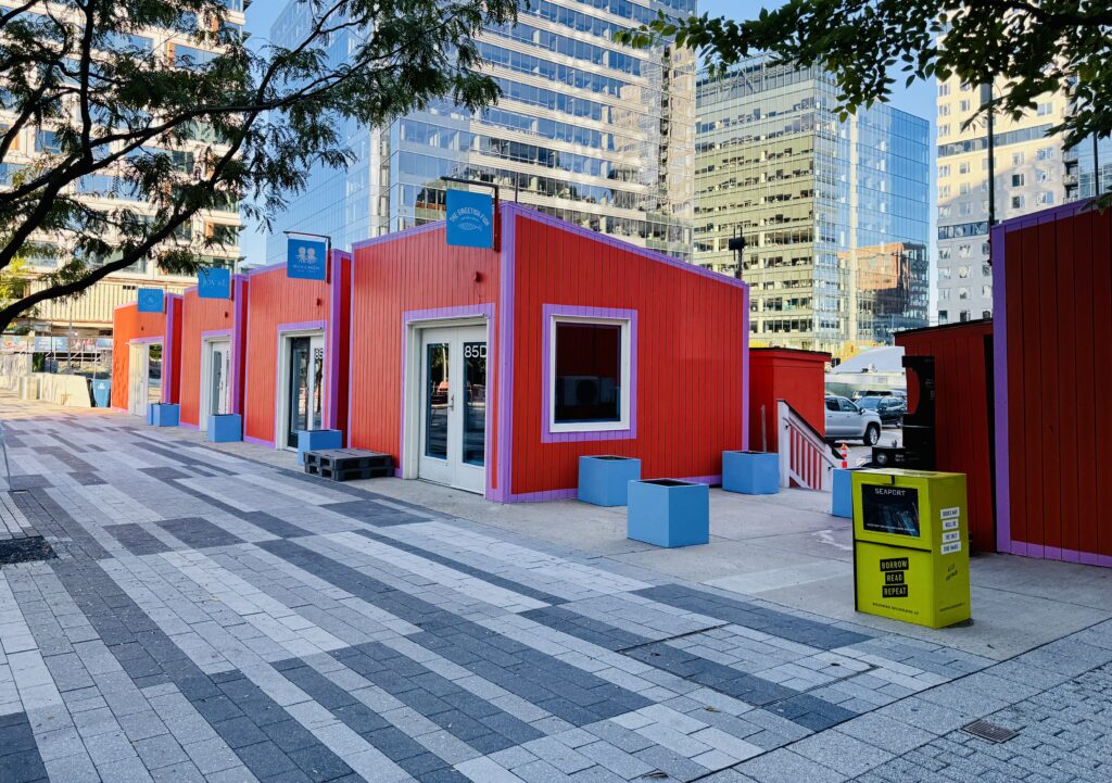
fonts of the posters, cards, etc..I like the seaport designs.
During the summer, these pop up stores were greenish tone.
I liked those too.
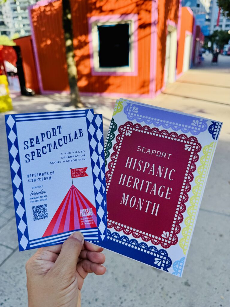
Seaport sometimes has the free giveaway stuffs.
/
I am always impressed their goods designs.
Usually the free stuff has the role of advertising the company and sometimes the logos are too much on the product.
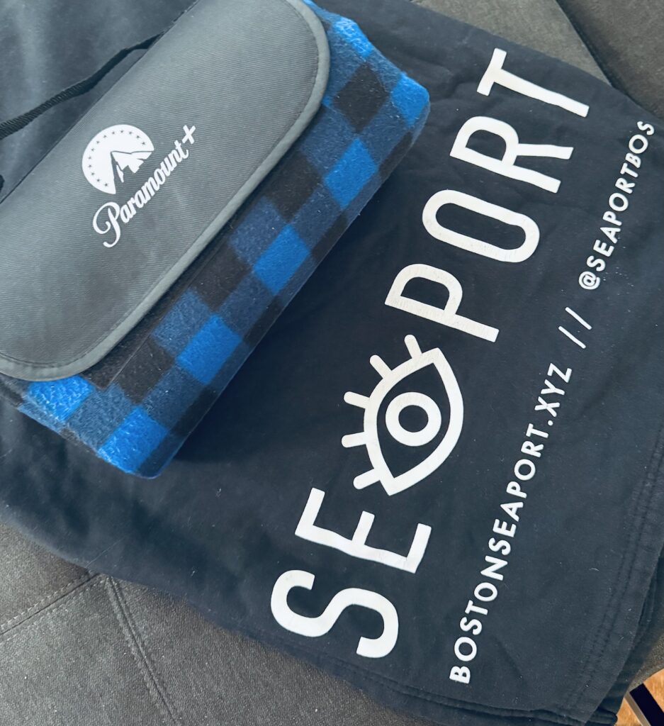
Most of case, seaport products are simple and chic.
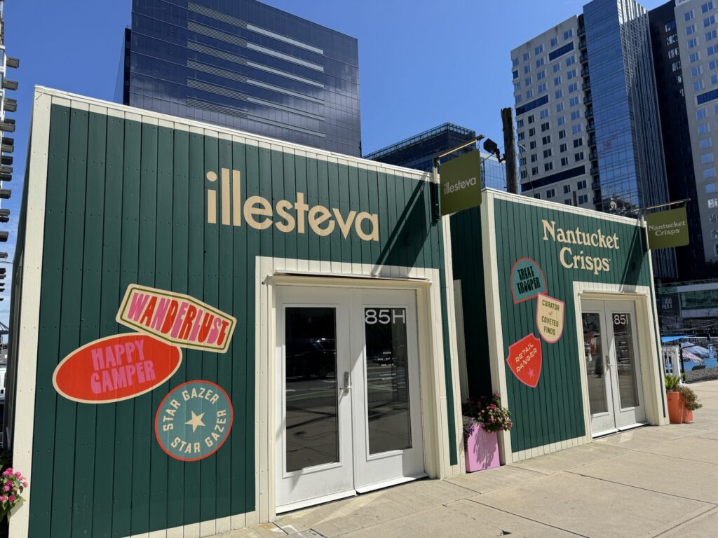
In 2024, I got a blanket for the outdoor movie. This was cute picnic blanket style check pattern but blue tone for stands as seaport theme color.
Sometimes they are not simple but probably Intentionally colorful, like the retro style.
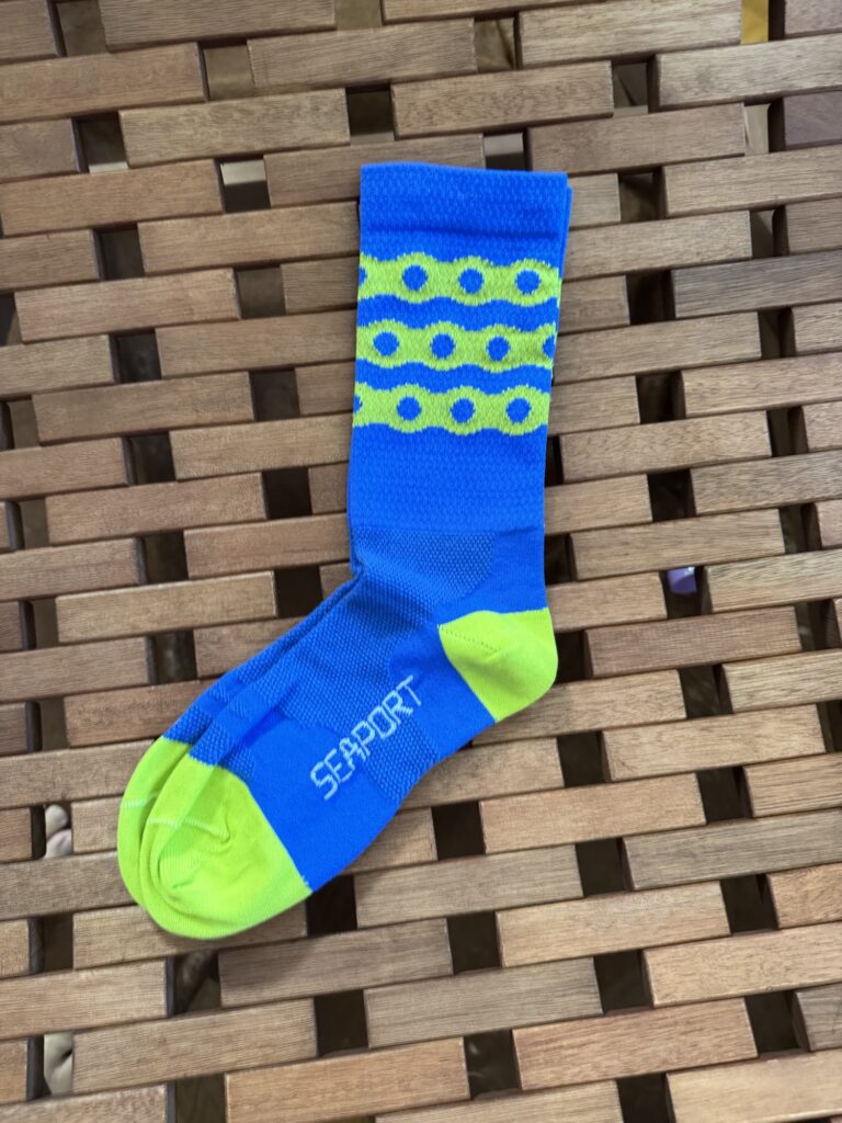
These socks I got this year 2025 bike maintenance at seaport.
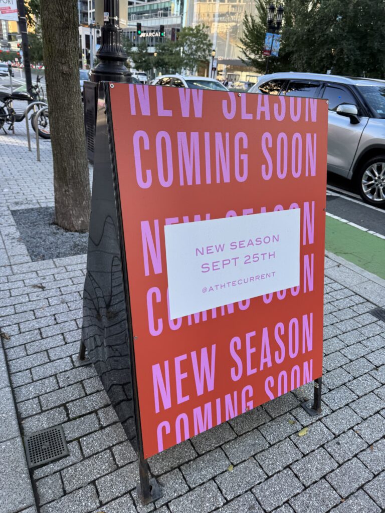
Font collection studying for my works
Walking around town and observing the fonts and colors of the trendy posters, cards is my part of research to design my own work.
Now I am making the winter event posters.
More warm tone? I will work on it!